How to decorate with Pantone's colours of the year 2021

Pantone have announced their Colours (yes, plural!) of the year for 2021 and they have taken us all at KTM Design rather by surprise! The colours were announced last week on social media as follows:
“PANTONE 17-5104 Ultimate Gray + PANTONE 13-0647 Illuminating, a marriage of colour conveying a message of strength and hopefulness that is both enduring and uplifting.”
We can, however, see their logic behind teaming a comforting and reliable mid-grey such as with an optimistic and invigorating yellow. We think (and I’m paraphrasing here) that they’re telling us to cheer the heck up.
Grey has been the most popular colour for home decoration, all over the house, for several years now. It just goes with everything, it’s soft, soothing, gentle and, well, dare I say… a bit safe?
During a year like 2020, where so many of us are spending more time than ever at home, perhaps it’s time for us to inject some of this vibrant colour into our spaces.
Yellow is THE colour of optimism and positivity. It is playful and friendly. It demands our attention. The downside of this is that, in large doses, it can be pretty intense. Great if you’re the type of person who loves to be challenged by their surroundings, not so great if you just want to feel at home. So here is our how-to guide to decorating with these colours:
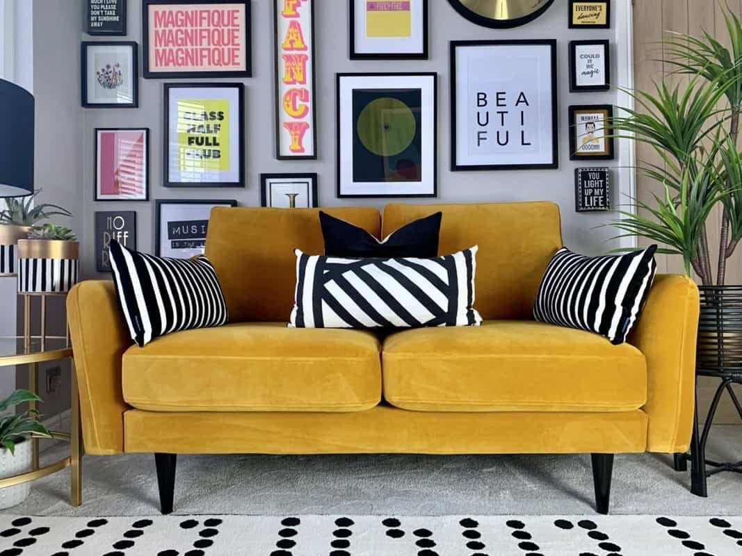
A statement chair
How great does plush velvet look in yellow? Such richness of colour and touchy-feelyness! Invest in a sumptuous lounge chair or sofa in this colour, against a backdrop of mid-grey it will shine like a beacon of loveliness! Alternatively, some squishy, velvet cushions such as the Munro from Liberty or the Tahiti cushion from Copper and Pink

Pops of paint
Don’t fancy an entire yellow wall? Try a pop of colour on your woodwork instead. How about the inside of a door, a skirting board or perhaps just the door frame? We think these painted doors look beautiful and provide just enough vibrant yellow to really lift an otherwise fairly muted colour scheme.

Throws and blankets
In the bedroom it’s all about the textures again. A velvet bedspread in glorious yellow, like this one from the French Bedding Company would be just spectacular to wake up to.
Kitchens
These can be tricky areas to change colour dramatically. It can be a real faff painting around kitchen units and no one’s suggesting you start from scratch and put in a new yellow kitchen (unless you love yellow of course in which case, go for your life!).
Accent walls can really dial up the energy within an otherwise fairly monochromatic space (and look SO good behind black framed prints). If that’s not your bag, how about a statement pendant light such as this Kartell Fly light from Heals over your kitchen island, some zesty yellow barstools around it or just some sweet accents and accessories such as these Orla Kiely storage jars, or a vase of these beautiful, dried flowers from Rockett St George?


Bathroom
If you already have a grey bathroom, yellow accessories - especially luxurious bath mats - can look incredible. If you’re planning a brand new bathroom and yellow is a favourite colour of yours, why not go all out on a canary yellow cast iron bath such as this one from Victorian plumbing? So striking against monochrome wall and floor tiles. Even more striking against these Paintbox Canary tiles from Mandarin stone, especially with black hardware!
Fortune favours the bold, as they say…