Colour Trends Of 2026
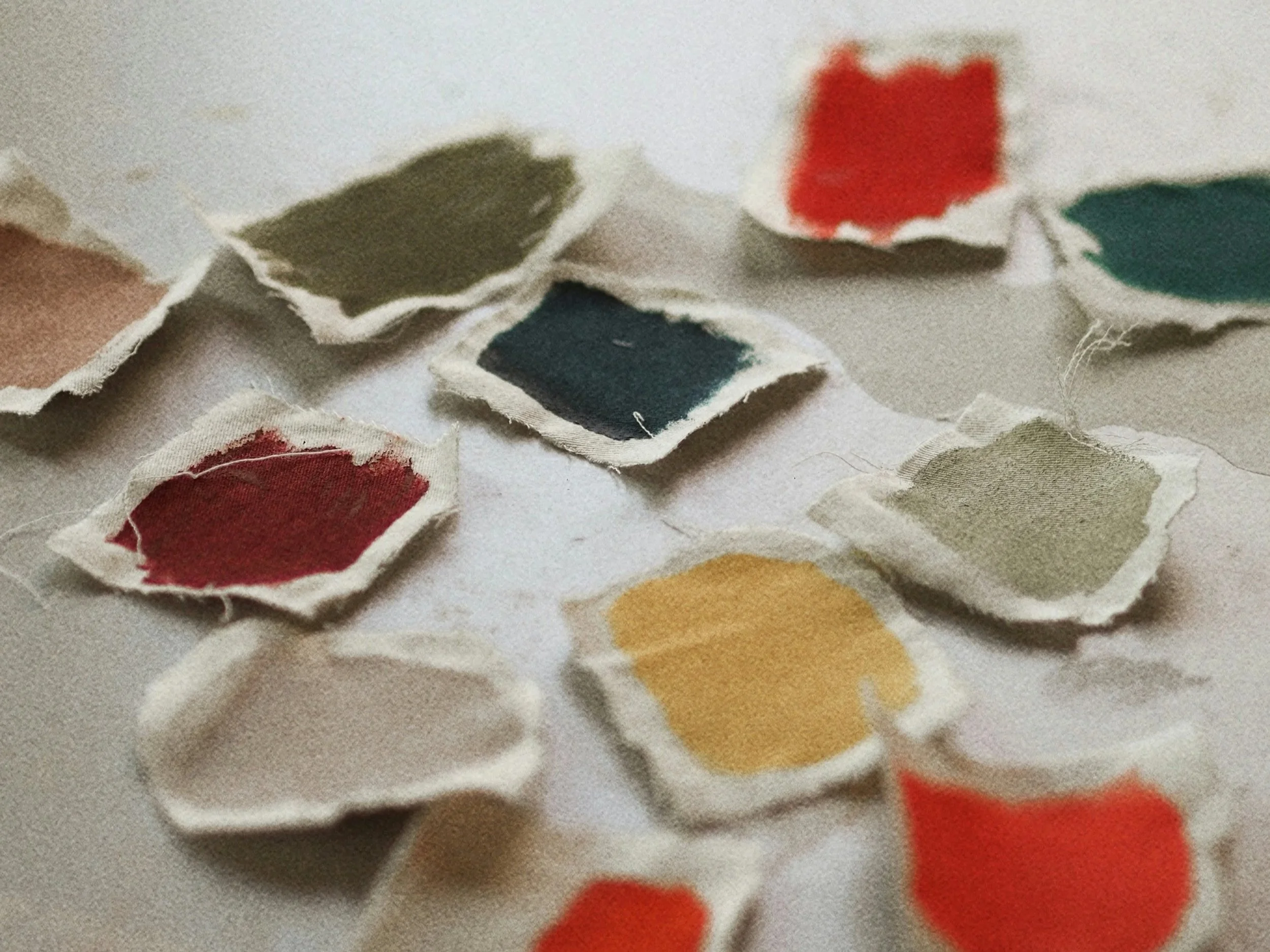
As we move into 2026, colour is becoming more expressive, yet deeply considered. Rather than fleeting trends or high impact statements, the palettes emerging this year are rooted in emotion, atmosphere and longevity.
At KTM Design, we’re seeing a clear shift towards depth over brightness, mood over minimalism and colour that supports how spaces are truly lived in. The 2026 palette reflects a desire for interior that feel intimate, grounding and confidently personal.
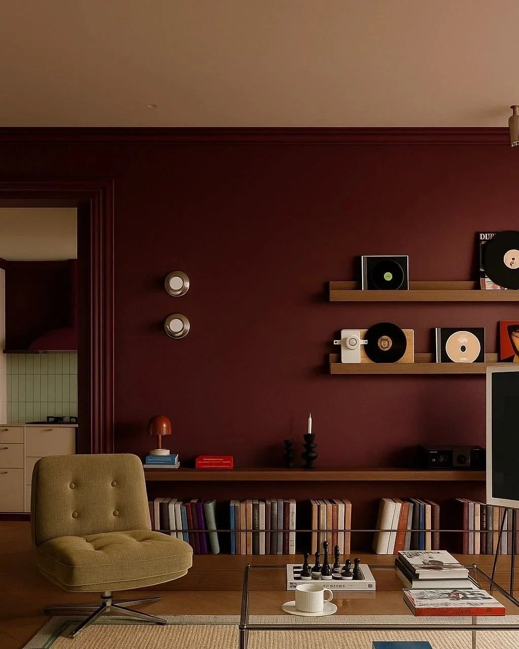
Rich & Moody Jewel Tones
Jewel tones return in 2026 with renewed sophistication. Deep burgundies, plums and emerald greens bring drama and warmth, creating interiors that feel cocooning and luxurious without being overpowering.
These tones work particularly well in:
Living spaces designed for relaxion
Hospitality environments seeking intimacy
Statement joinery, upholstery and feature walls
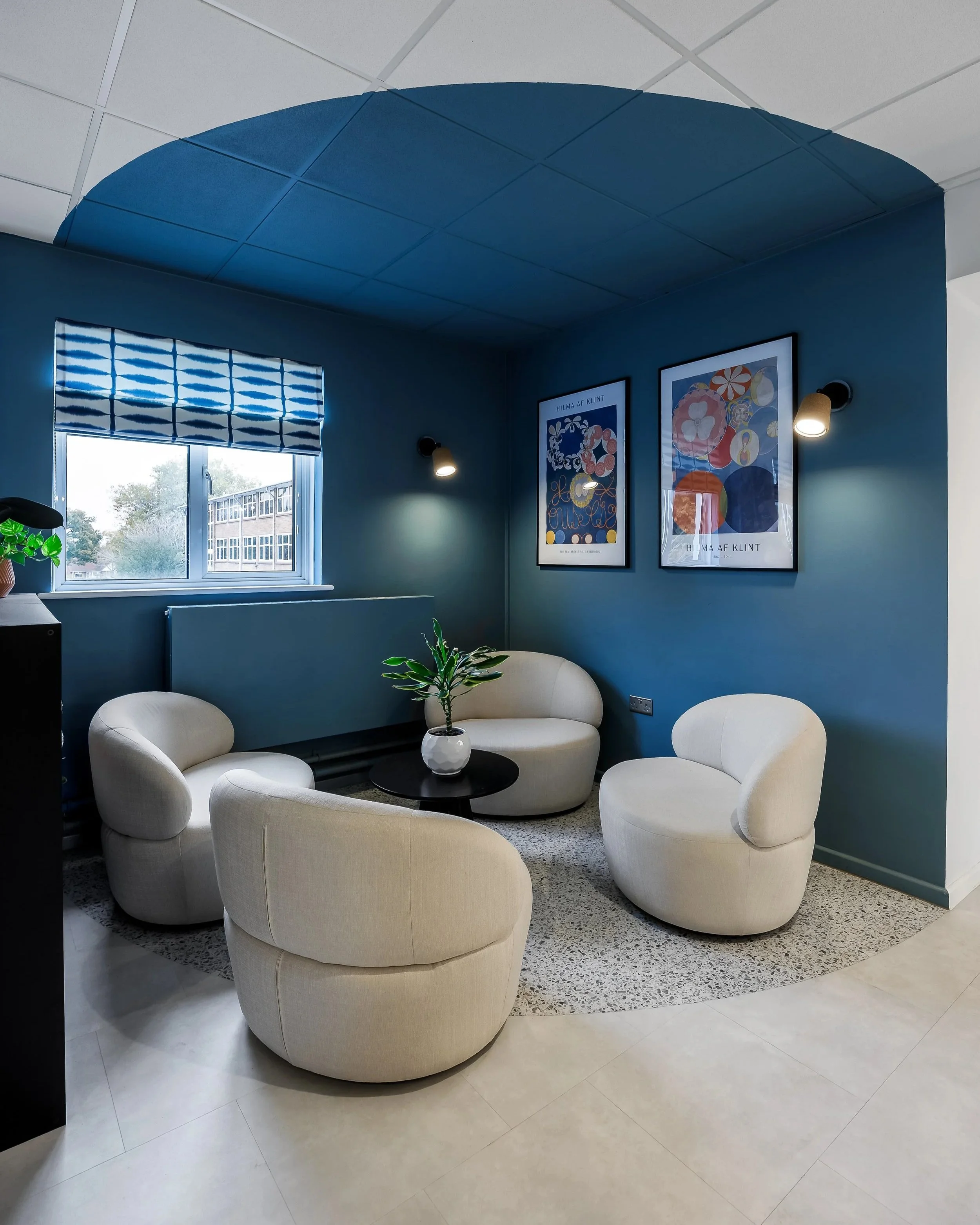
Indigo & Blue Hues: Calm With Character
Blues continue to evolve, with indigo bases hues leading the conversation into 2026. Rich yet versatile, indigo blues balance calmness with depth, making them suitable across residential, workplace and commercial interiors.
Recognised within Dulux’s 2026 palette, these blues act as grounding neutrals while still offering presence and personality.
Key characteristics include:
A sense of calm and focus
Compatibility with both warm and cool materials
Adaptability across lighting conditions
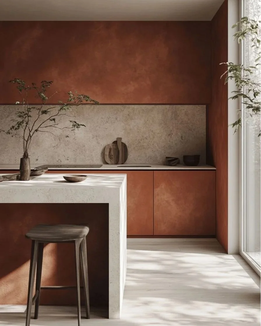
Earthy & Spice Tones: Warmth With Authenticity
Earth led colour continues to anchor design trends, but in 2026 it becomes richer and more expressive. Spice inspired shades such as burnt ochre, cinnamon, clove and deep terracotta are increasingly popular in kitchens, dining spaces and communal interiors.
These colours bring warmth and character, offering a lived in quality that feels authentic rather than styled.
We’re seeing these tones used to:
Add depth to cabinetry and joinery
Complement natural stone and clay finishes
Create inviting, sociable environments.
Designing With Mood, Not Just Colour
What defines the 2026 palette is not a single shade, but the emotional side behind colour choices. Each hue plays a role in shaping atmosphere support comfort, creativity and connection.
At KTM Design, colour is always considered in context: alongside texture, light and materiality. The most successful interiors are those where colour feels intentional, grounded and enduring.
Looking Ahead
Colour trends in 2026 reflect a move towards interiors that are confident, expressive and deeply human. Rich jewel tones, calming blues and grounded earth shades offer designers the tools to create spaces that feel personal, purposeful and timeless.
As design continues to evolve, colour will remain one of the most powerful ways to tell a story not through bold statements, but through thoughtful, layered expression.