The Importance of Colour Psychology
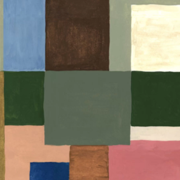
Have you ever wondered why you feel a certain way or emotion when entering a space? Why you feel calm or energized or sensing tension creeping into your body? Interior Architecture and Design sets the mood of the space and environment, and one of the integral components that helps the tone of that is the use of colour, also known as colour psychology. Explore how colours affect a space and how you can apply it too.
Warm Colours
Warm colours, such as red, orange, and yellow, are associated with energy, excitement, and passion. These colours are used to create a sense of warmth and cosiness in a room, or can even add a touch of drama and excitement.
Red: Red is the most stimulating colour on the spectrum, and it is often used in kitchens and dining rooms to stimulate appetite and conversation. It can also be used to create a sense of drama and excitement in a room, such as in an accent wall or fireplace. However, it is important to use red sparingly, as too much red can be overwhelming.
Orange: Orange is a cheerful and optimistic colour that can be used to create a warm and inviting space. It is often used in living rooms and family rooms to promote conversation and socialisation. Orange can also be used to compliment other warm colours in the room, such as red and yellow.
Yellow: Yellow is another cheerful colour that is often associated with happiness and sunshine. It can be used to create a bright and airy space, or to add a touch of warmth to a room. Yellow is often used in kitchens and bathrooms to promote energy and positivity.
Fun Fact: This is also why most fast-food chains opt for warm colours.
Cool Colours
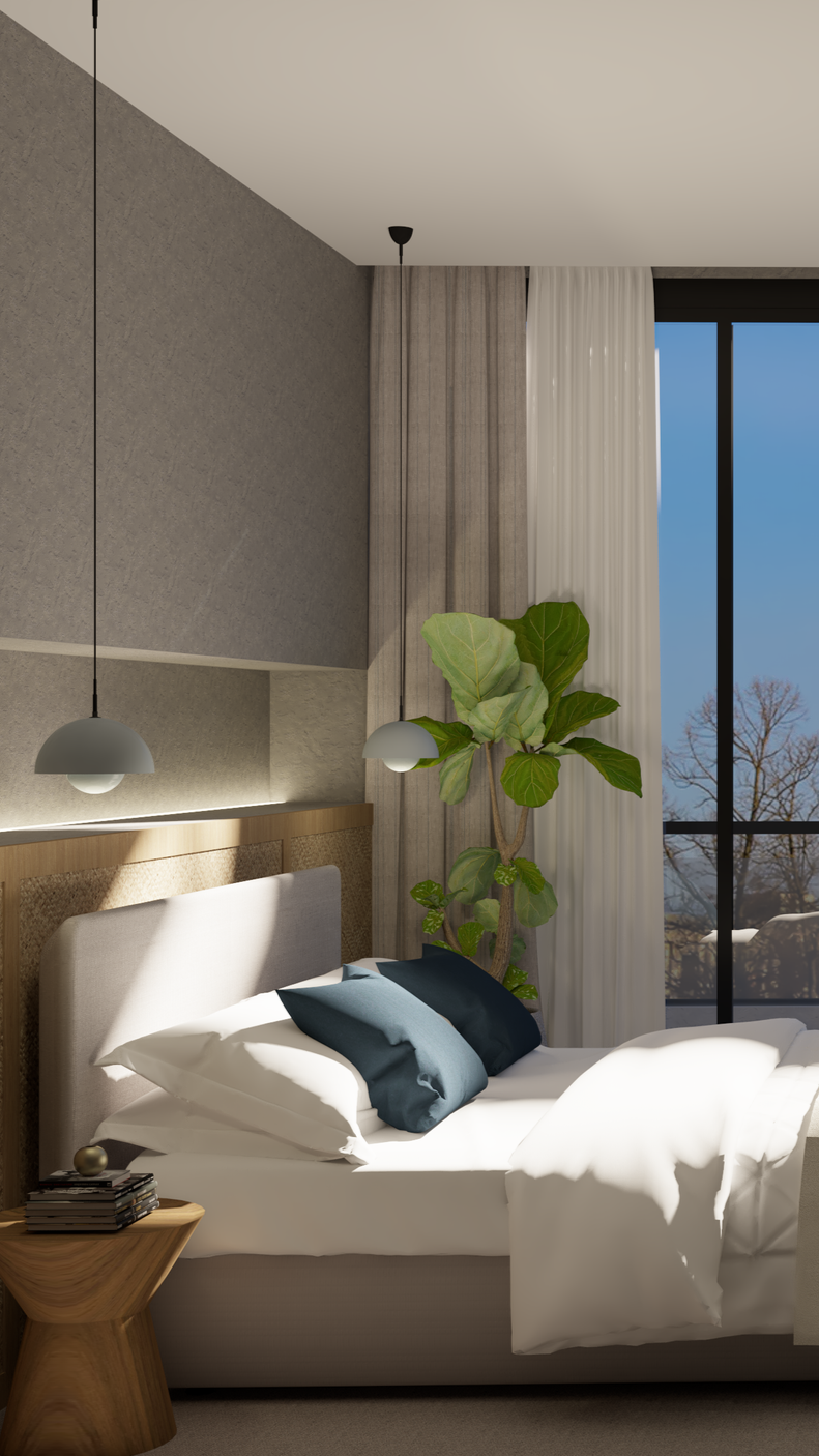
Cool colours, such as blue, green, and purple, are associated with calm, relaxation, and peace. They can be used to create a sense of tranquility in a room, or to promote focus and concentration.
Blue: Blue is promoted as the most calming and relaxing in design, and it is often used in bedrooms and bathrooms to encourage sleep and relaxation. Blue can also be used to create a sense of peace and calmness in other areas of the home, such as in a home office or living room.
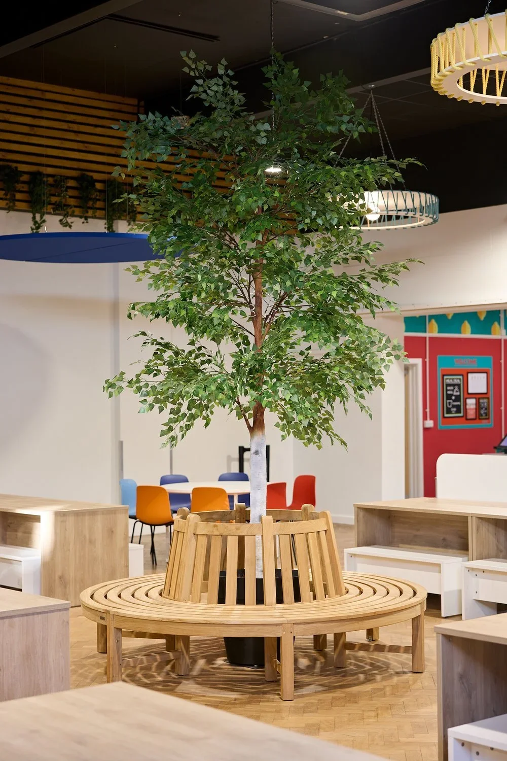
Green: Green is a versatile colour that can be used to create a variety of moods and atmospheres. It is often associated with nature and growth, and can be used to create a sense of calm and relaxation in a room. Green is also used to promote focus and concentration, making it a good choice for home offices and study areas.
Purple: Purple is a royal and luxurious colour that is often associated with mystery and intrigue. It’s commonly used to create a sense of sophistication and elegance in a room, or to add a touch of drama and excitement. Purple is often used in living rooms, bedrooms, and dining rooms.
Neutral Colours
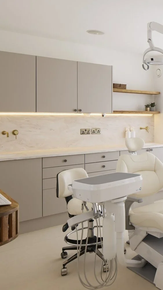
Neutral colours, such as white, black, and beige, are versatile and can be used to create a variety of moods. They can be used to create a minimalist and modern look, or to add warmth and texture to a room.
White: White is a clean and fresh colour that can be used to create a bright and airy space. Often used in kitchens, bathrooms, and bedrooms to create a sense of cleanliness and hygiene.
Black: Black is a bold and dramatic colour that can be used to create a sense of sophistication and elegance in a room. It also signifies as simplicity and functionality and is often used as an accent colour to highlight other colours in a room, or to create a focal point, such as a fireplace or accent wall.
Beige: Beige is a warm and neutral colour that can be used to create a sense of comfort and relaxation in a room. Commonly used in living rooms and bedrooms to create a cosy and inviting space.